At Pocket FM, thumbnails are the first interaction point for millions of users. They tell a story visually hinting at what’s inside, what’s trending, what’s premium, and what’s worth listening to. But until recently, these powerful visuals were built on a system that hadn’t evolved with the pace of our content or user expectations.
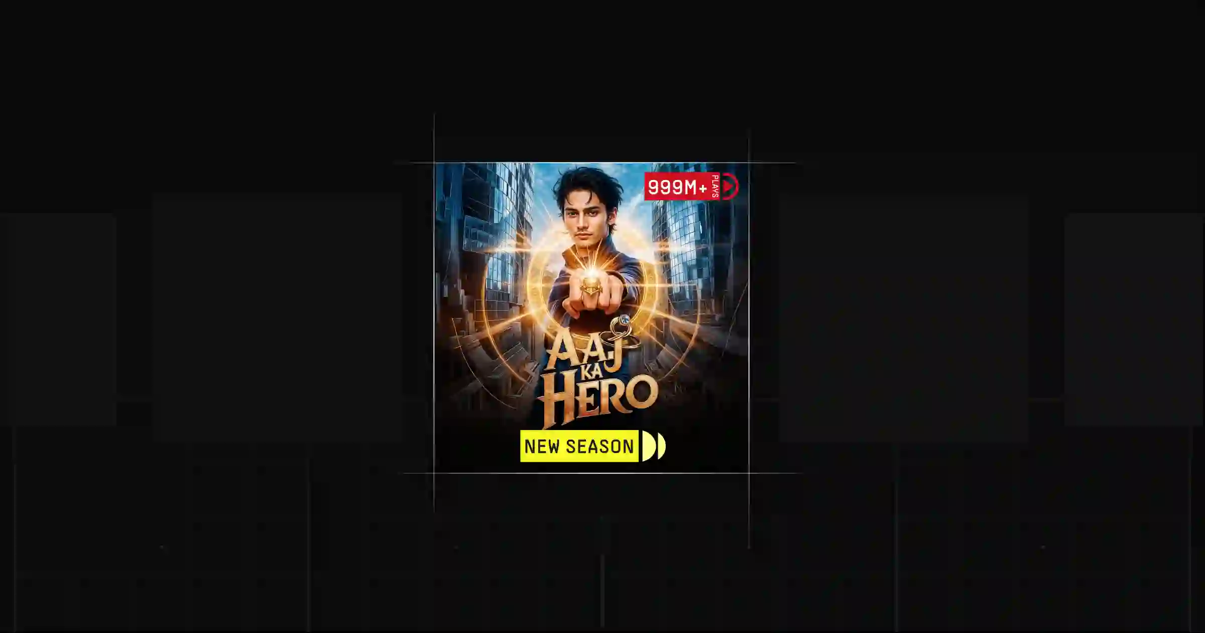
Tags like “New” or “Premium” were previously rasterized into static images, and elements like play counts, progress indicators, or coin requirements had to be manually overlaid using Photoshop-like workflows. Given our large and active user base, it’s common for metrics like play counts to shift by thousands within minutes. This meant that even small updates—whether it was adding a new badge or refreshing metadata—required hours of manual effort and tight coordination between design and content teams.
With the new system in place, we’ve eliminated these bottlenecks by automating repetitive tasks and streamlining workflows. What once took hours now happens in real time—freeing teams to focus on higher-value design and content initiatives rather than operational maintenance.
That system couldn’t scale.
So, we reimagined it from the ground up.
While thumbnails are, at their core, pieces of artwork, our first step was a mindset shift: to approach them as modular UI components—designed not just for aesthetics, but for scalability and function.
We envisioned a framework where tags, badges, and metadata weren’t baked into the image but layered dynamically through the frontend—just like any other interface element. This allowed for:
Real-time updates via backend controls
Surface-level consistency across web, app, and marketing
Elimination of redundant asset production
It wasn’t just a design change. It was a complete shift in how we thought about visual systems.
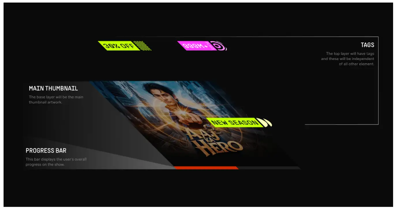
Designing visual tags for audio thumbnails required a careful balance between aesthetics and functionality. But before diving into visual elements, we first redefined the thumbnail structure itself. With newer thumbnails occupying larger surface areas across the app, we conducted a comprehensive audit across platforms—spanning entertainment, live streaming, music, and more. Our goal was to understand current industry standards in thumbnail sizing, aspect ratios, and UI treatment.
We found a common aspect ratio trend and closely studied how leading platforms managed tag placement, progress bars, and metadata to avoid overlapping key visual areas like title art or character faces. Armed with these insights, we returned to the drawing board and tested multiple thumbnail dimensions, also considering alternate ratios for future use cases across the broader Pocket Entertainment umbrella.
Once we had a scalable and consistent structure in place—with clearly defined safe zones for content, tag overlays, and progress indicators—we shifted focus to the tagging system itself.
We created a comprehensive visual system where each element serves a clear purpose through thoughtful design choices. Our approach focused on developing custom tags with distinct shapes, patterns, and colors to communicate various information types effectively. Whether it was a “New” badge, a coin requirement, or a “Premium” tag, every label was designed to be instantly recognizable and harmoniously integrated into the overall thumbnail layout.
We embraced visual semiotics—the study of how users interpret visual meaning—to create a truly universal design language. Each tag type received its own unique visual identity through:
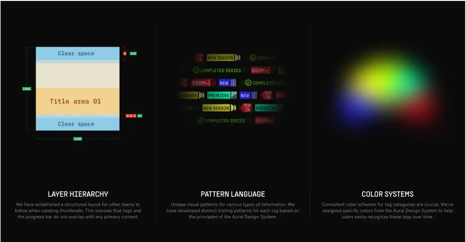
This systematic approach resulted in a design framework that's not just visually appealing, but also highly functional and accessible. The system particularly shines in its international scalability, working effectively across language barriers and different cultural contexts. As users interact with these thoughtfully designed elements, they develop an intuitive understanding of the platform's visual language, leading to improved navigation and overall user experience.
With the new framework, experimentation became significantly easier. We decoupled metadata and layout logic so teams could:
Roll out new tags via backend configs
Run A/B tests on tag visibility, and style
Dynamically highlight trends, play counts, or unlock status
Instead of manually redesigning assets for each test, we now configure logic in the backend and let the UI render everything on the fly.
What used to take days, now takes minutes.
The impact of this shift has been profound:
We’ve reduced repetitive design work and increased velocity
Experiments and campaigns now launch with minimal effort
Thumbnail layouts are responsive, data-driven, and context-aware
The framework gracefully handles edge cases like offline mode, broken metadata, or surface-specific adaptations
But perhaps most importantly, the framework has given us the freedom to evolve—without having to constantly rebuild.
The dynamic framework isn’t the end—it’s the foundation.
We’re already exploring ways to make thumbnails personalized based on user behavior, preferred genres, or listening history. Imagine thumbnails that adjust based on whether you’re a binge listener or a casual browser. Or visuals that change based on your local language, time of day, or even emotional tone of the story.
The possibilities are immense—and we now have the structure to support them.
Designing at scale isn’t just about building things faster—it’s about building smarter. By treating thumbnails as a system, not a static artifact, we unlocked flexibility, clarity, and consistency across the entire platform.
This evolution wasn’t just a visual upgrade. It was a design philosophy shift—and one that’s already shaping the future of how we craft content discovery experiences at Pocket FM.